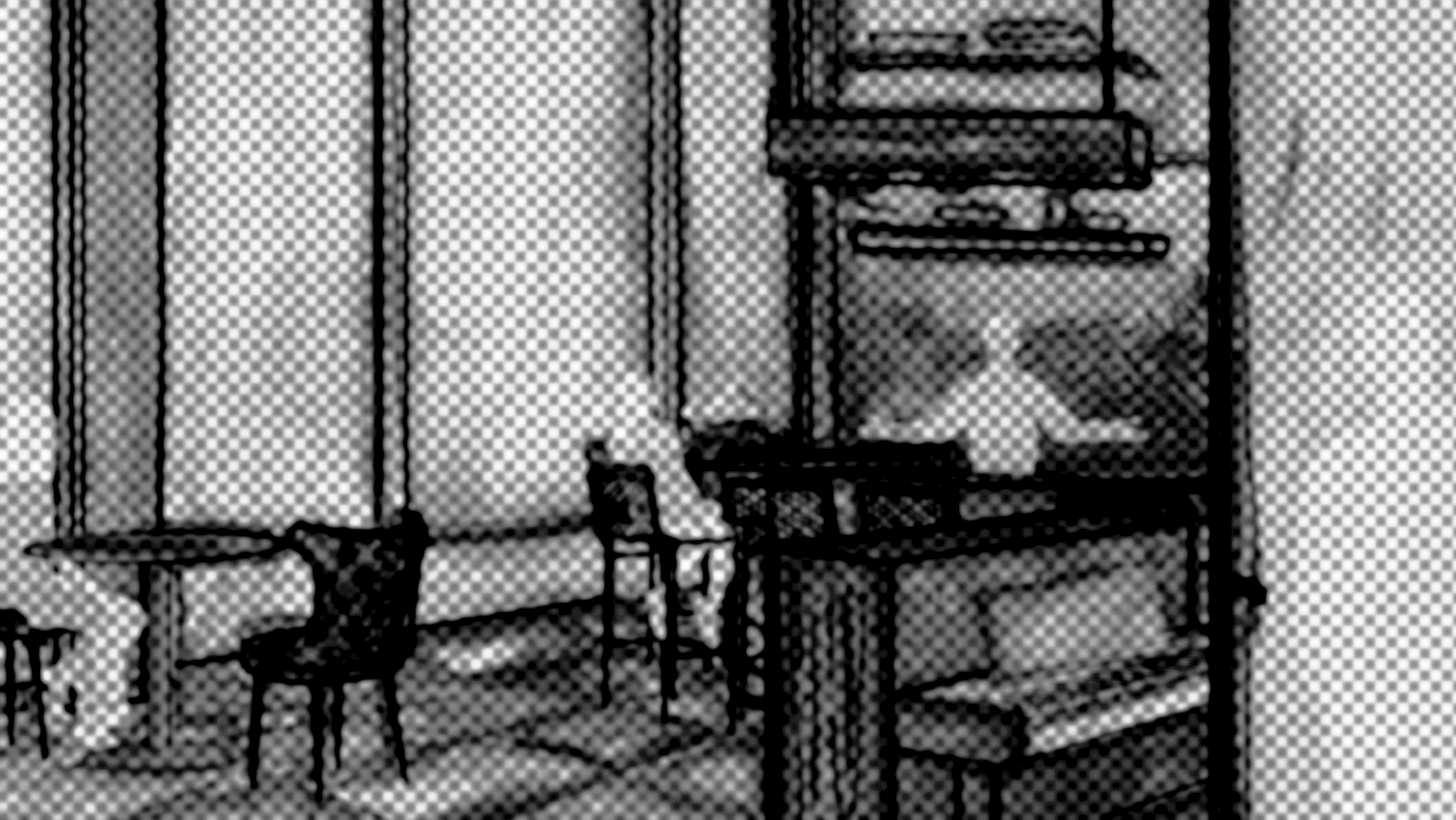
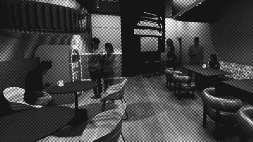
Companion Lounge
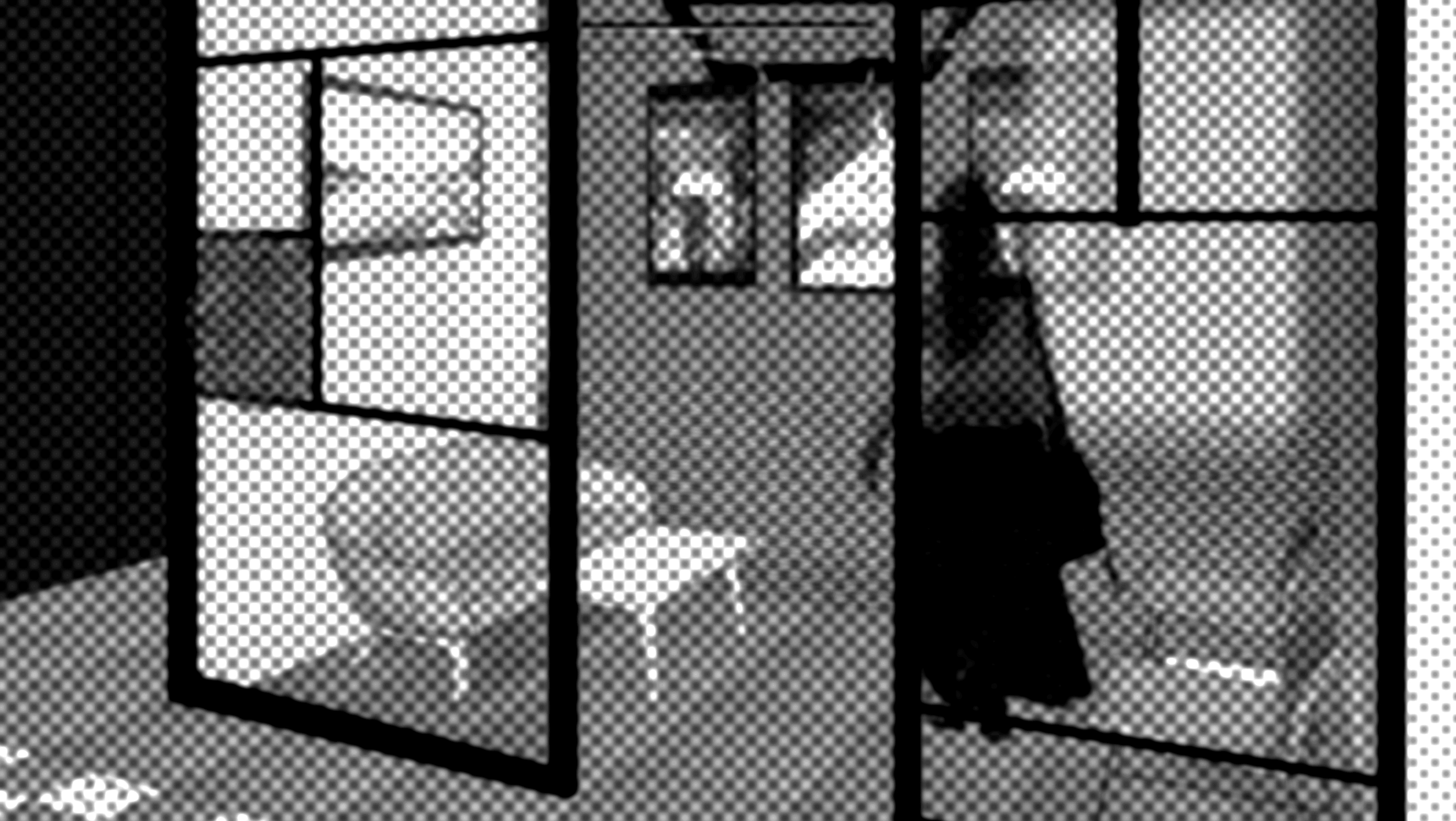
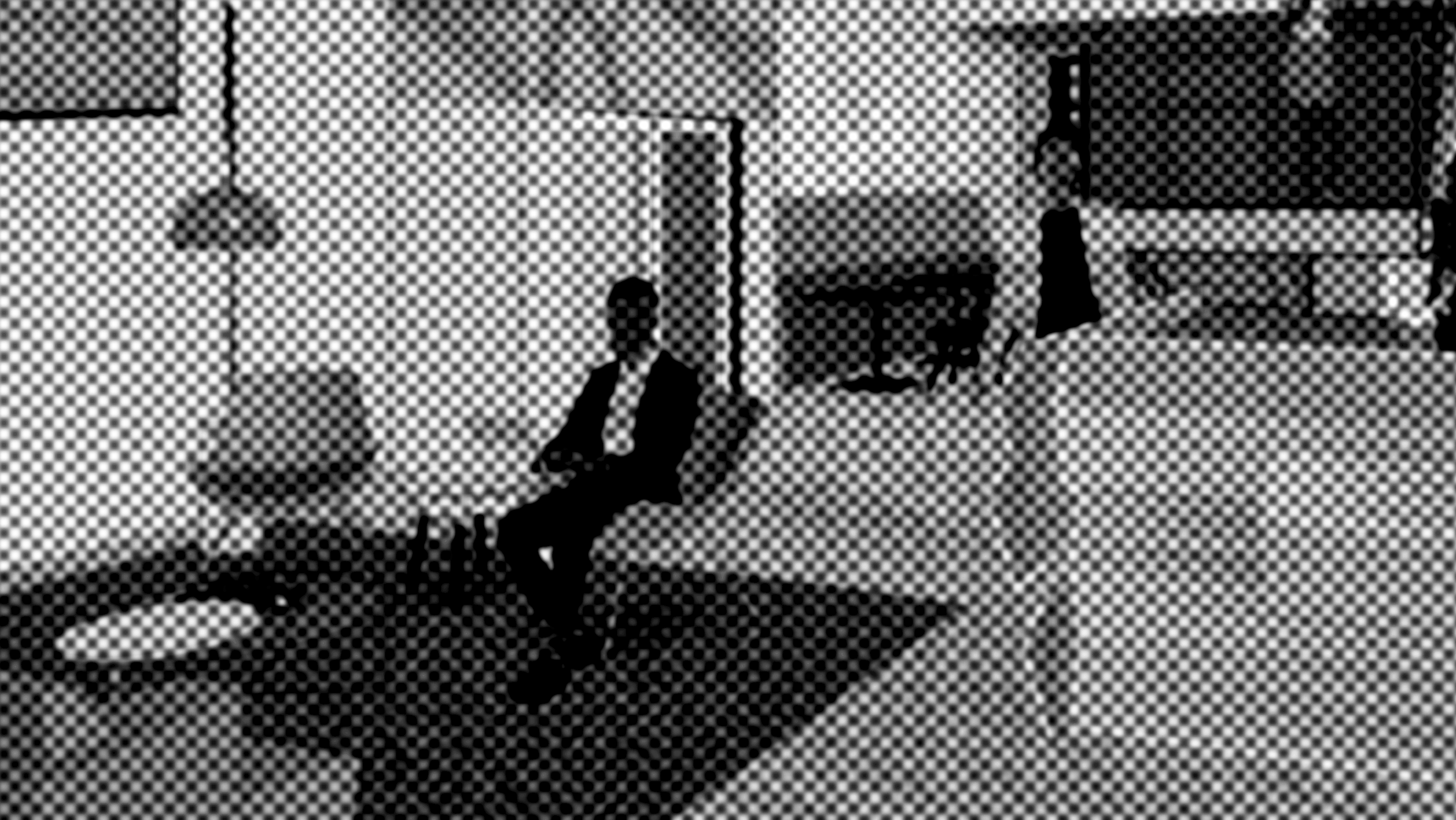
Rendering of the companion lounge. Made in Revit, rendered in Enscape, and edited in Photoshop.
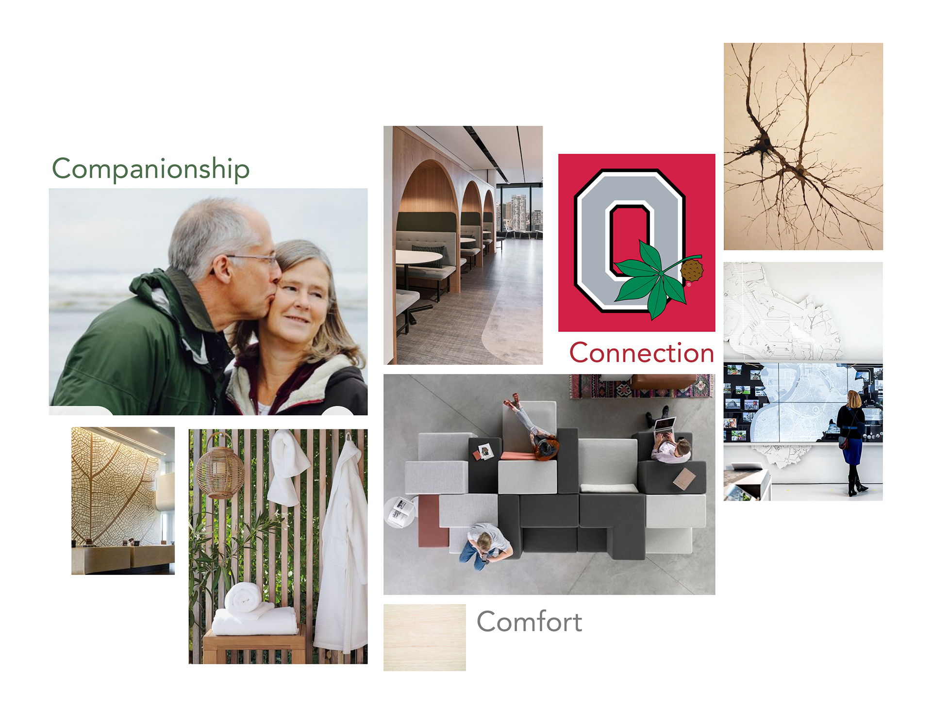
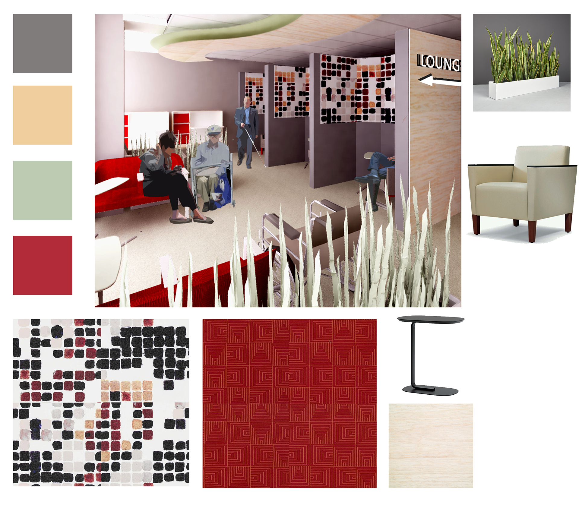
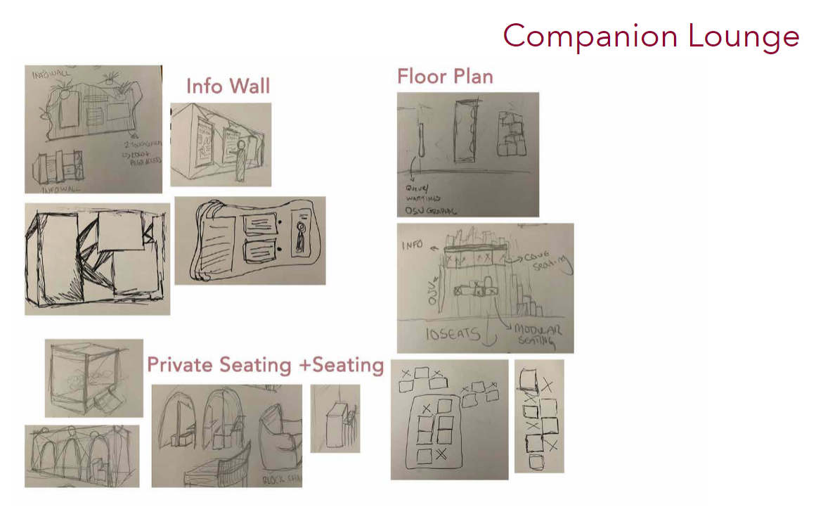
The Companion Lounge aims to provide a sanctuary of comfort and connection. It uses education as a method to both entertain while they wait as well as provide clarity on their loved ones’ conditions. Seating emphasizes comfort for an extended period of time. It incorporates technology on both a public and private scale. Touch screens offer answers to questions, and a coded wait screen is in view. The lounge is private from the open plan, but still allows visibility to the main waiting area and checkout point. Patients may also chose to wait here as well. If they are prone to over stimulation or simply wish to have some personal space, the lounge has more concealed options to accommodate possible needs.
Vision Positioning Board
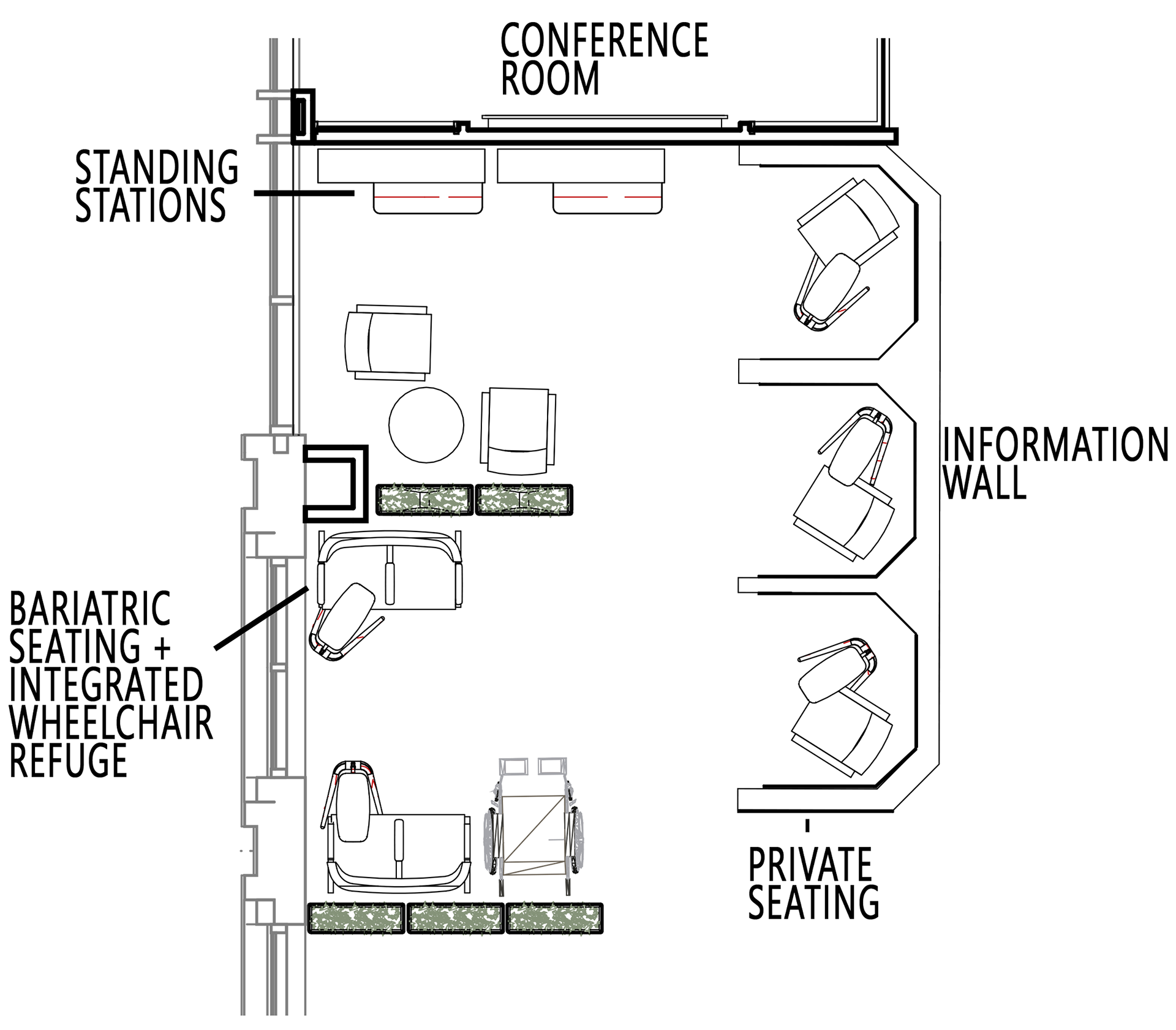
Plan View
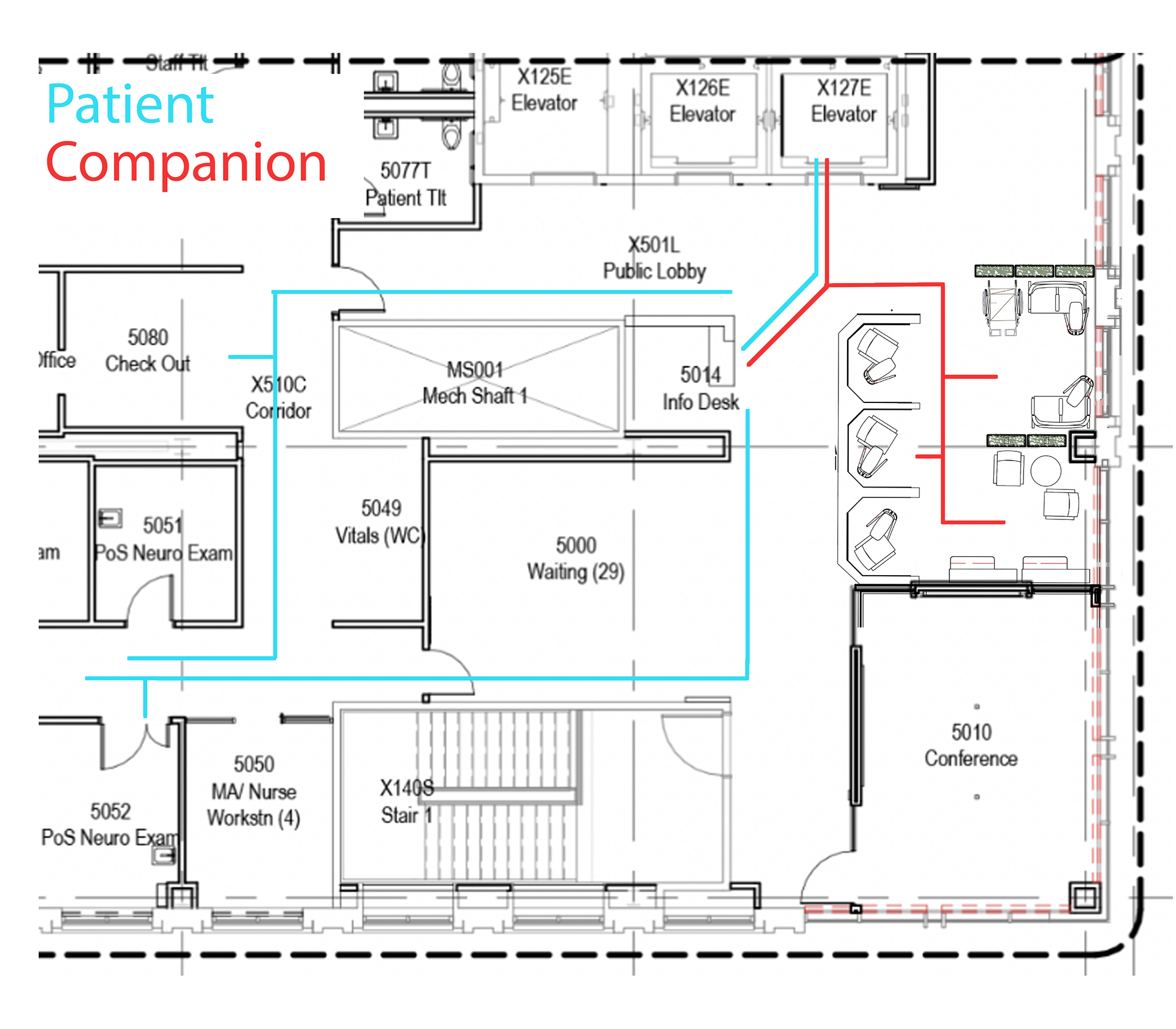
User Journey
Information Wall
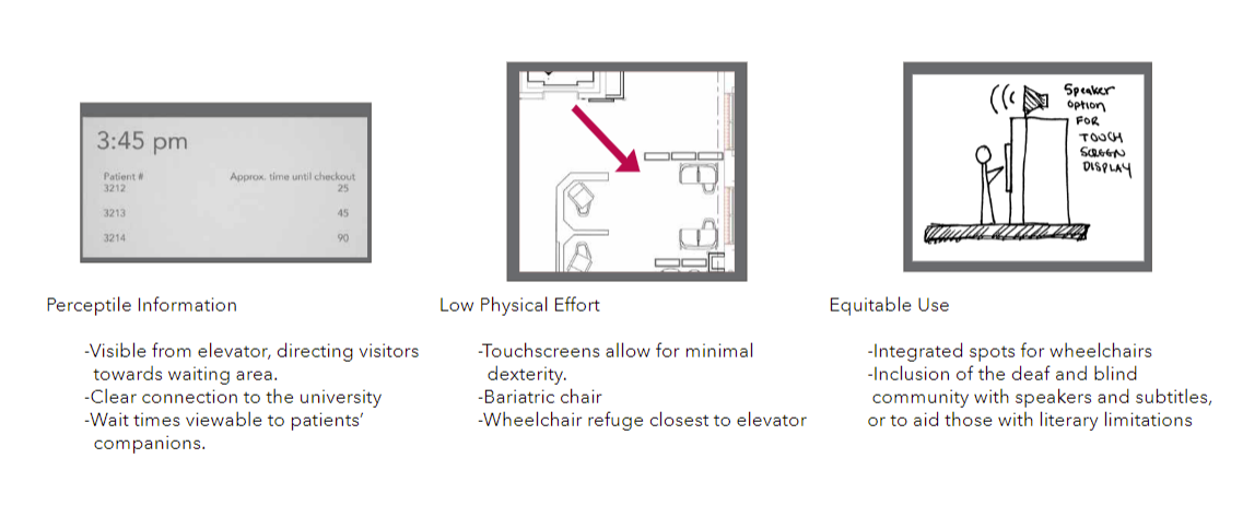
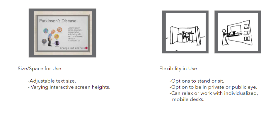
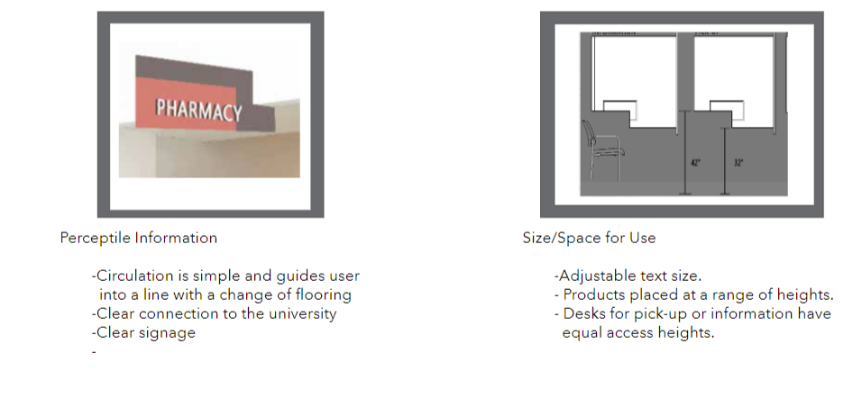
The touchscreens on the information wall are at varying heights to allow for people of different sizes to utilize the help inquiry kiosk. Additionally, the text size is adjustable for aging eyes or those who need it.
Universal Design Elements
Pharmacy Retail
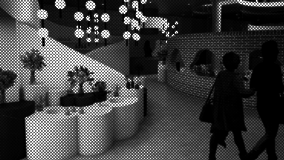
Rendering of Retail Pharmacy. Made in revit, rendered in enscape, and edited in photoshop.
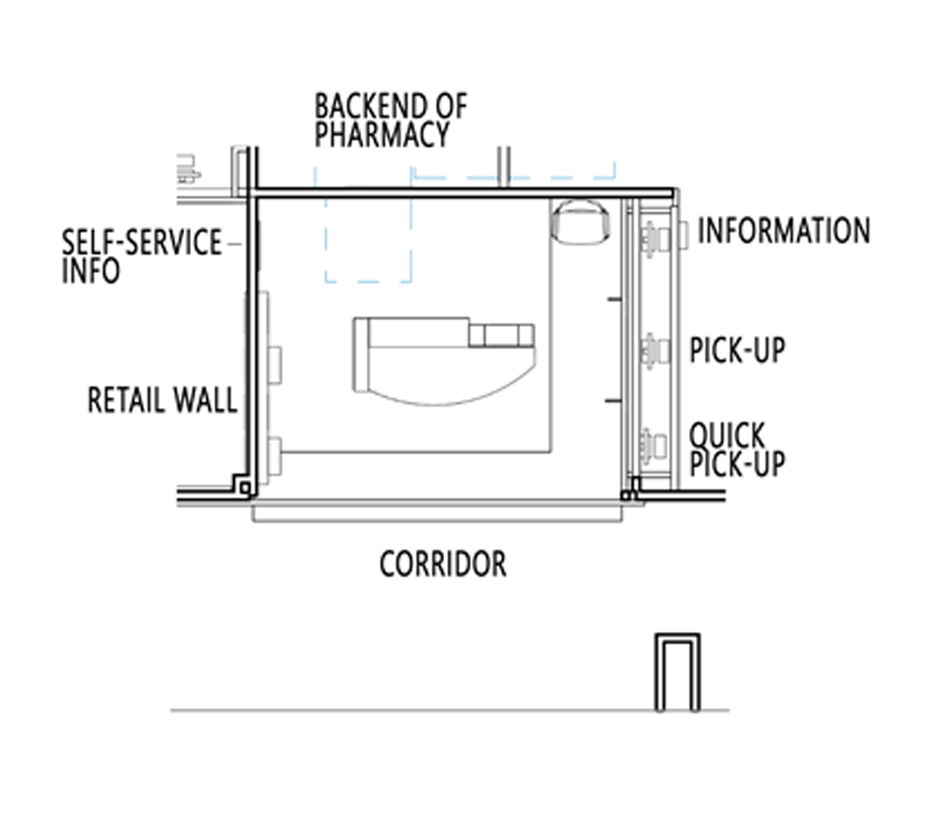
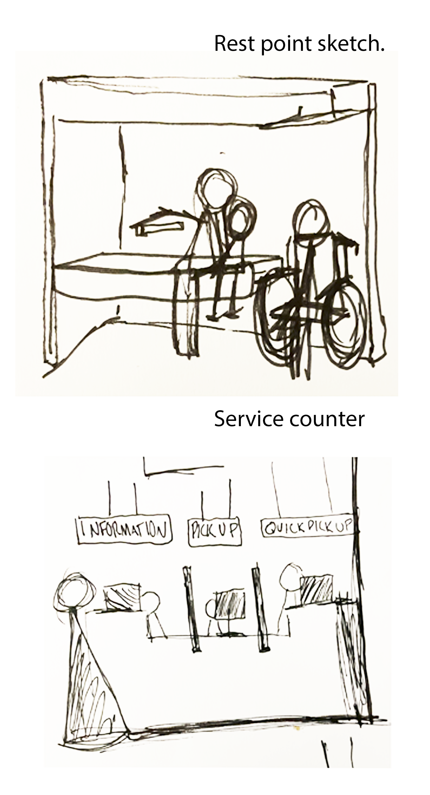
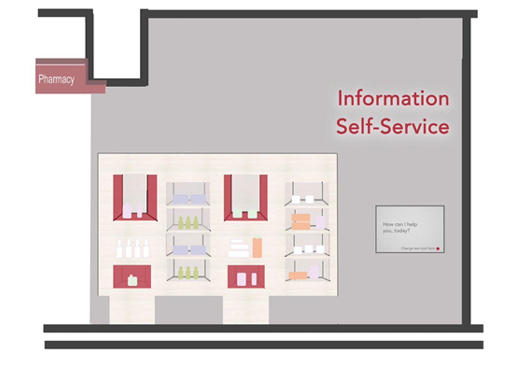
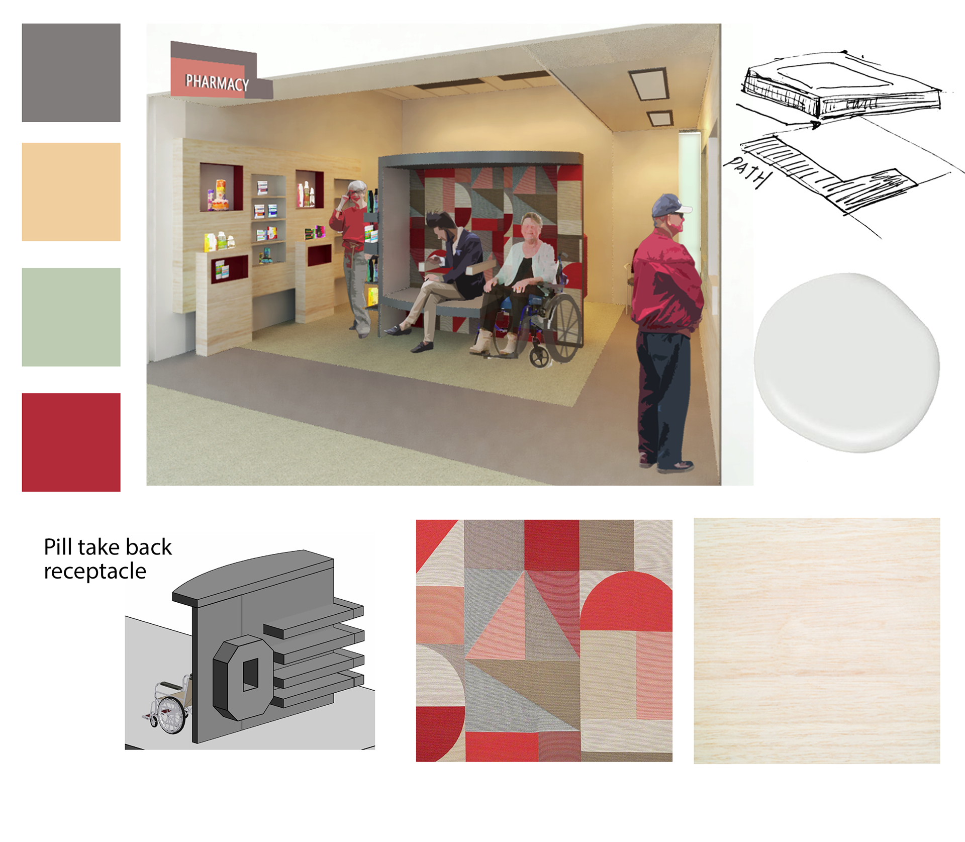
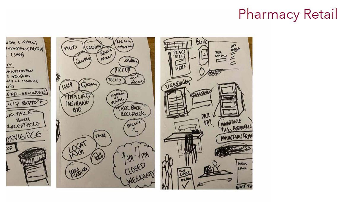
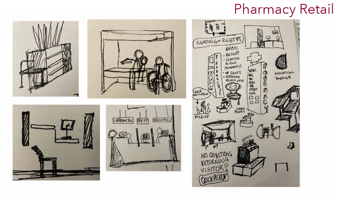
The pharmacy and it's retail components serve two goals, to educate and to protect. The pharmacy is a source of information. There is where one can learn about their medication/healing process and insurance/financial aid. This type of education requires both privacy and sensitivity. One may visit a virtual assistant at the self-service desk. To combat any anxiety brought into the space, the retail area supports a comfortable setting for acoustical and visual needs. Products are available at a variety of heights, as are both information and pick-up desks.The space aims to protect too. This can be through the pill take-back program. The new pharmacy will have a more attractive and available receptacle. The pharmacy currently offers a refill reminder as well as curbside pickup, but to those who may have a prescription, a quick pick-up line is offered. This may benefit those who have a refill, have no questions, or is in a hurry and would prefer to utilize the self-serve information program. The space clearly defines its three areas of use- retail, medication dispensary, and information.

Process Work
To better understand healthcare design , I composed a video case study on Omaha Veteran Affairs Ambulatory Care Center, completed by Leo A Daly. It is an analysis of user-centered design, emphasizing design for the aging as well as universal design. It is a beautifully completed project with the several recognitions, including the 2021 AIA National Healthcare Design Award.
Personas are a useful tool for guiding user-centered design when co-design is not feasible. This project considers how the older population interacts with space, and how space can support them where they may need it. To personalize this aspect (and make it fun as a class), I used my own aged image and loosely based it on a fictional future. This preliminary task informed my decision to focus on the companion and caregiver users.
Margaret Kane must visit the Outpatient Care New Albany Center Neurology department monthly to aid her mother-in-law’s worsening Alzheimer’s Disease. Despite her decline in health, she serves as the only individual with the time and ability to assist her 95-year-old MIL. They arrive for the visit promptly with ample enough time for Margaret to use the bathroom as well as help her MIL. Together they arrive to the fifth floor where they sit in the waiting room directly outside the entrance to the exam area. Once the staff have accompanied her MIL back, Margaret heads to the Companion Lounge where she lightly snacks and journals. She appreciates the private seating and acoustical panels as well as the abundance of natural light. If she ever gets bored of journaling, she knows she can explore the information wall to pass the time, but also learn about some of the new components to her MIL’s condition. Margaret can keep track of her MIL’s checkout time at the available screen. Once she sees her MIL is almost done, she returns to the elevators to pick her up from check-out. Now they must pick up her MIL’s prescription for donepezil at the first-floor pharmacy. The pharmacy is easy to see from the long hallway and they can take a quick rest stop inside as they wait for it to be filled. While her MIL sits, Margaret remembers her husband needs cold medicine, but due to her eyes she cannot compare brands. She uses the self-help info to scan the different labels to make the best choice. She uses the quick pick-up lane as her MIL’s medication is ready and she is a returning patient of the same medication. They check-out and leave the facility. The pair feel reassured and prepared for their next visit.
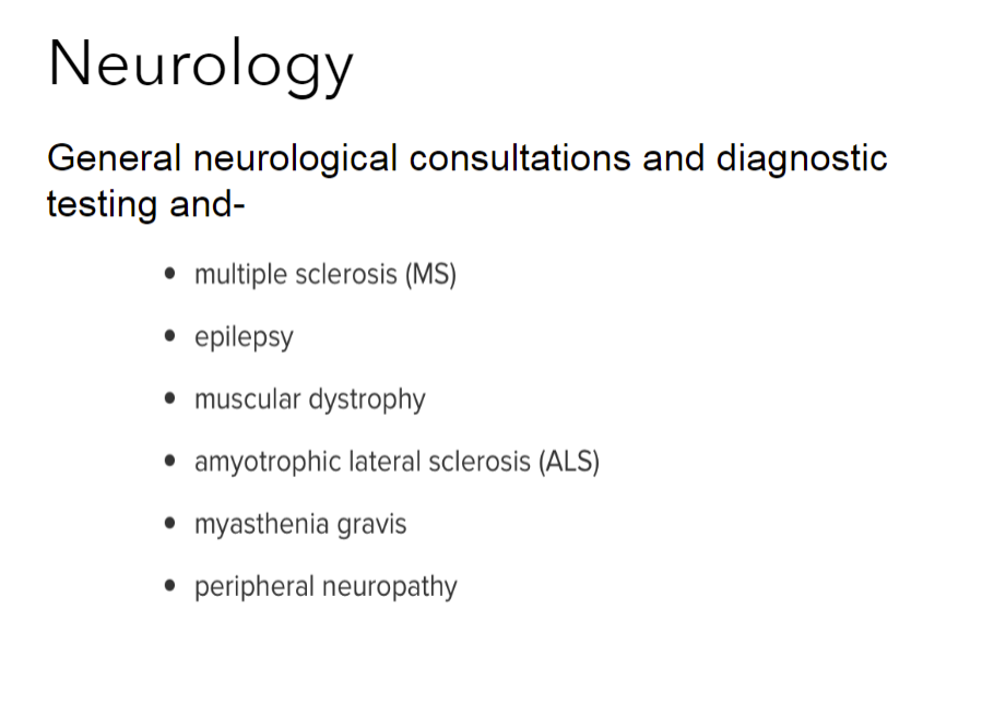
A short list of why a patient may go to the Neurology department
Outpatient Care New Albany is an existing medical facility that was in the final stage of Construction during the course of my project. Additionally, the center had a sister building located in Dublin, Ohio. The sister building was at an early stage in construction. Throughout this project, I was able to go to the various sites and understand the phases and conditions of a project of this scale.
