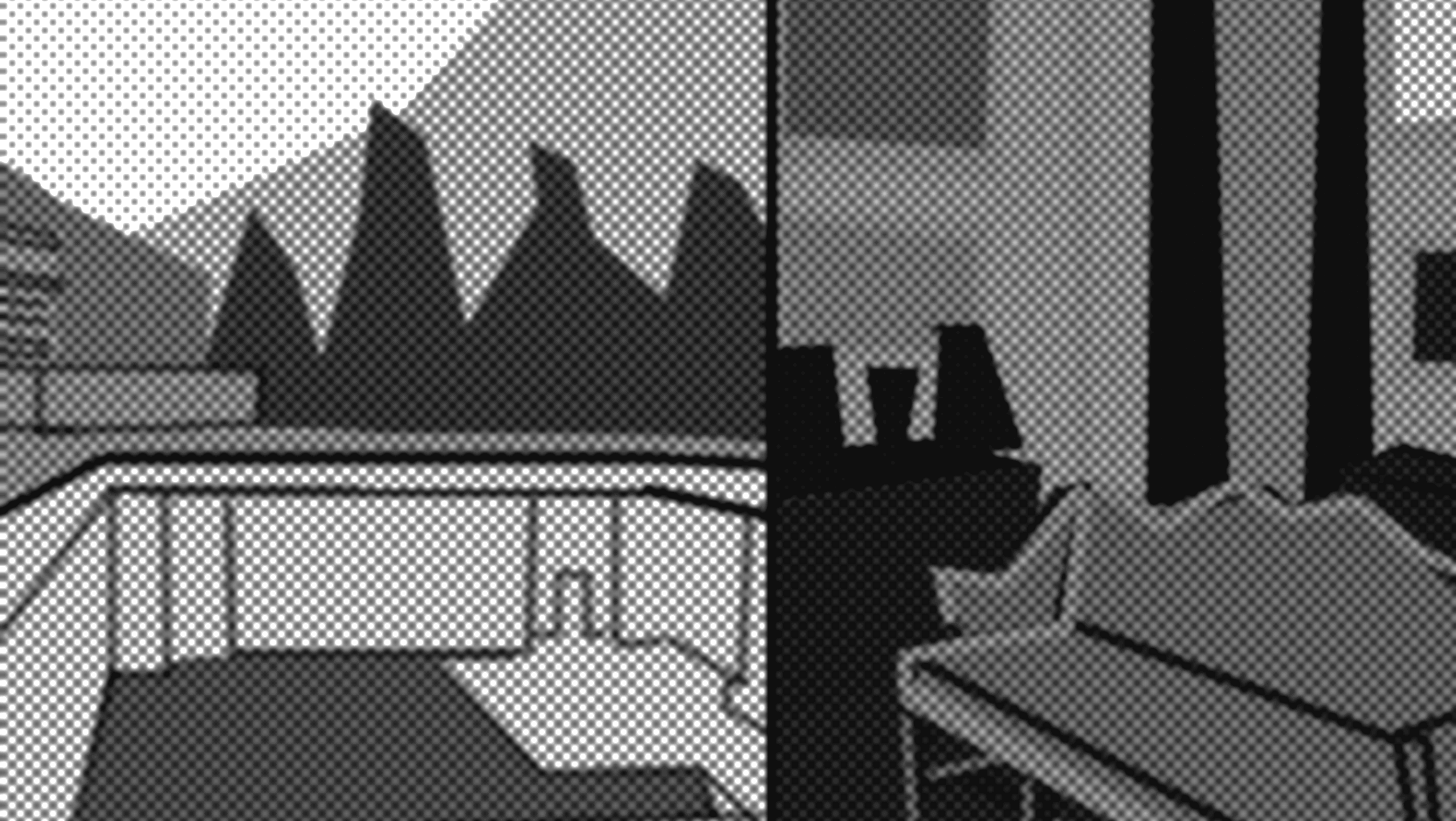
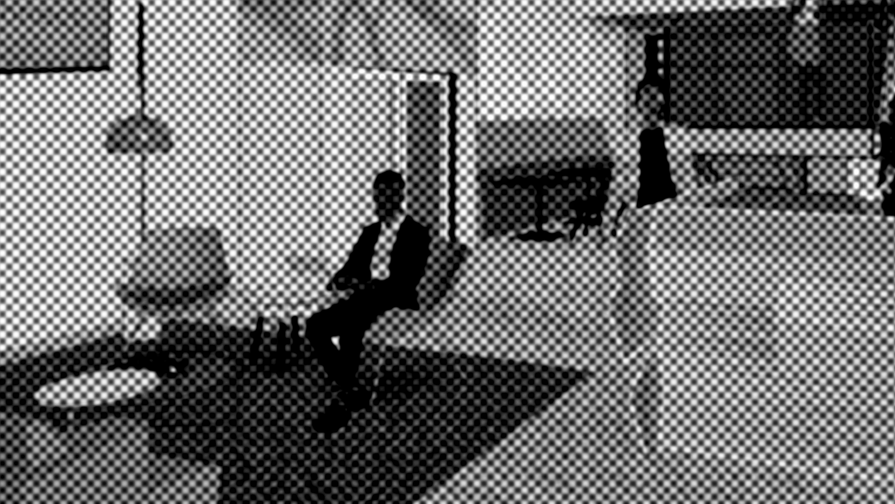
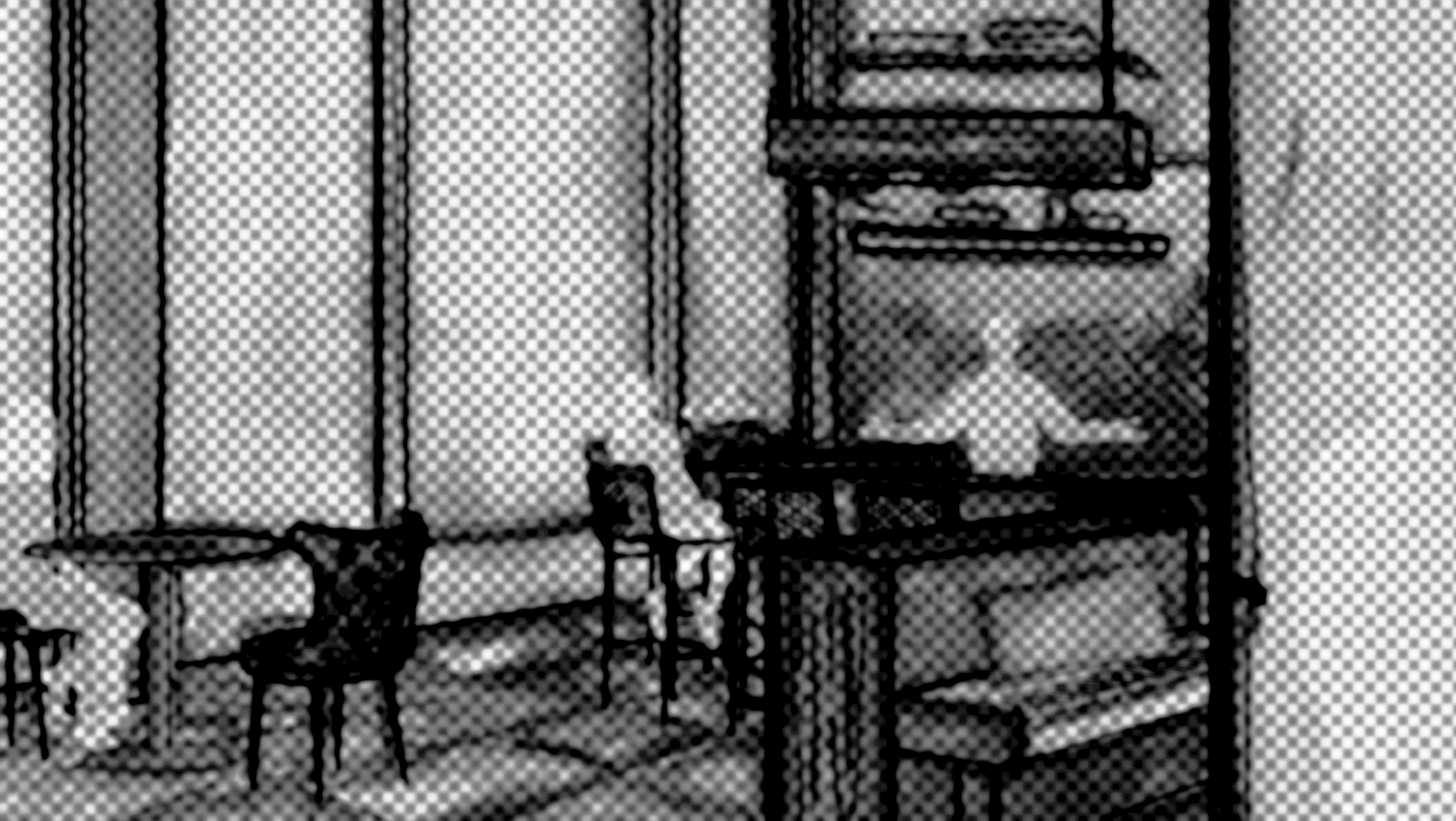
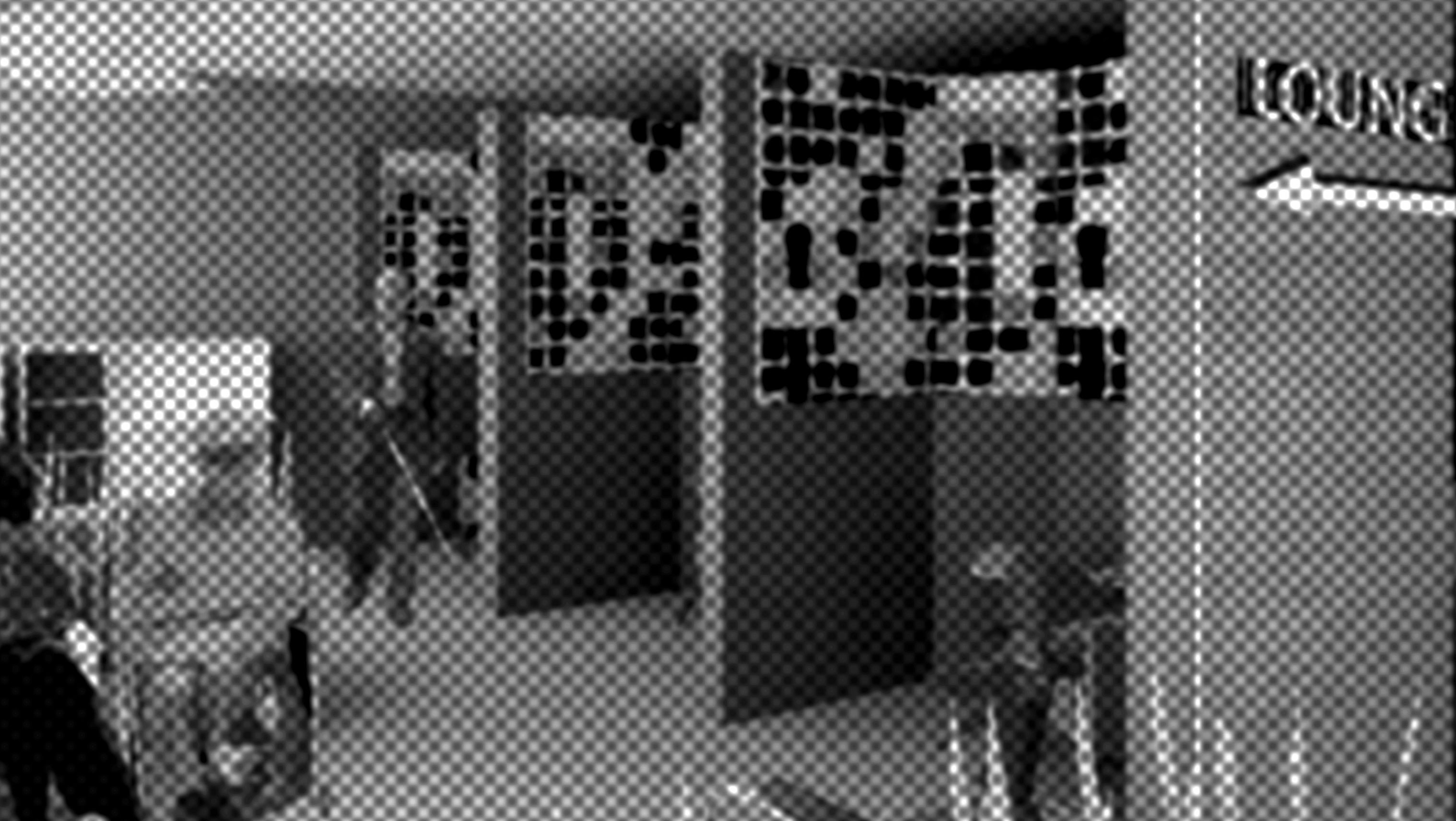
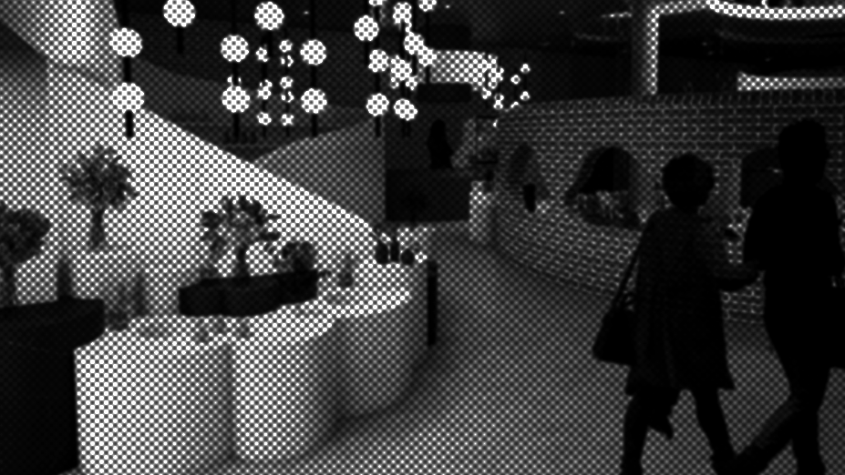
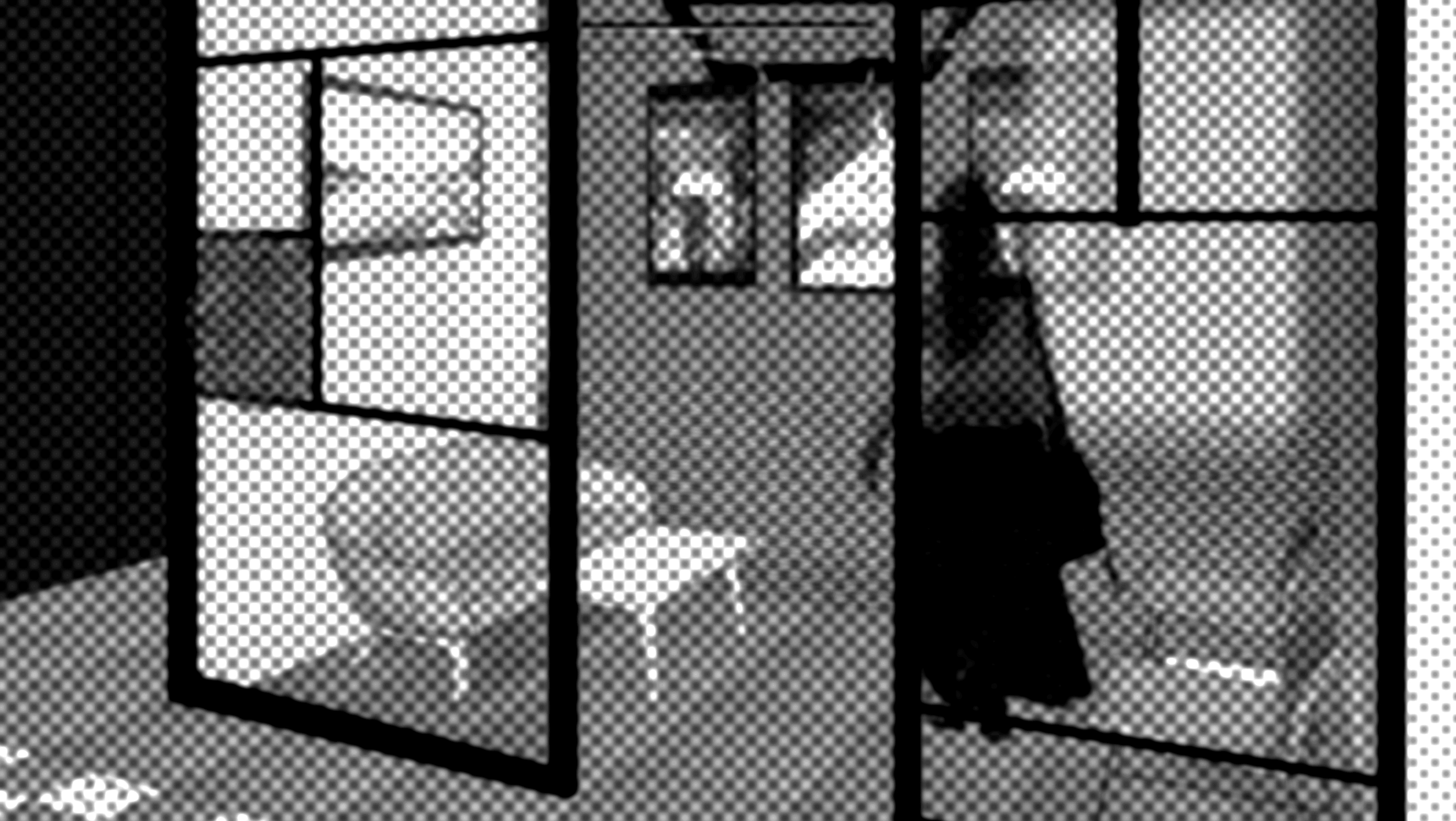
Rendering of the Record shop. Made in Revit, rendered in Enscape, and edited in Photoshop.
Developed in Revit and Edited in Photoshop
Developed in Revit and Edited in Photoshop
Grind n' Groove balances two initiatives, entertainment and engagement. The record store is strategically located before the cafe in the user's journey. This allows for exploration of the shop and highlighted records that might have been missed by patrons of just the coffee bar. Additionally, if the cafe is busy, the customer has the option to browse, or sample the product in one of the solo listening pods. This is a space for guests to interact with the product, each other, and the local music community, whether they are here for the coffee, music, or live shows.
Developed in Revit and Edited in Photoshop
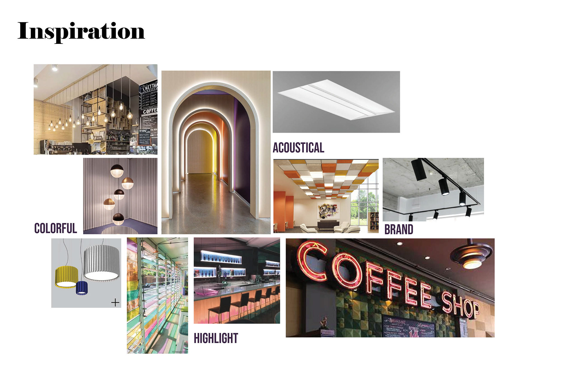
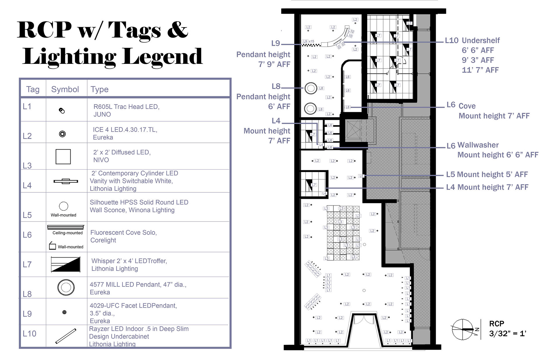
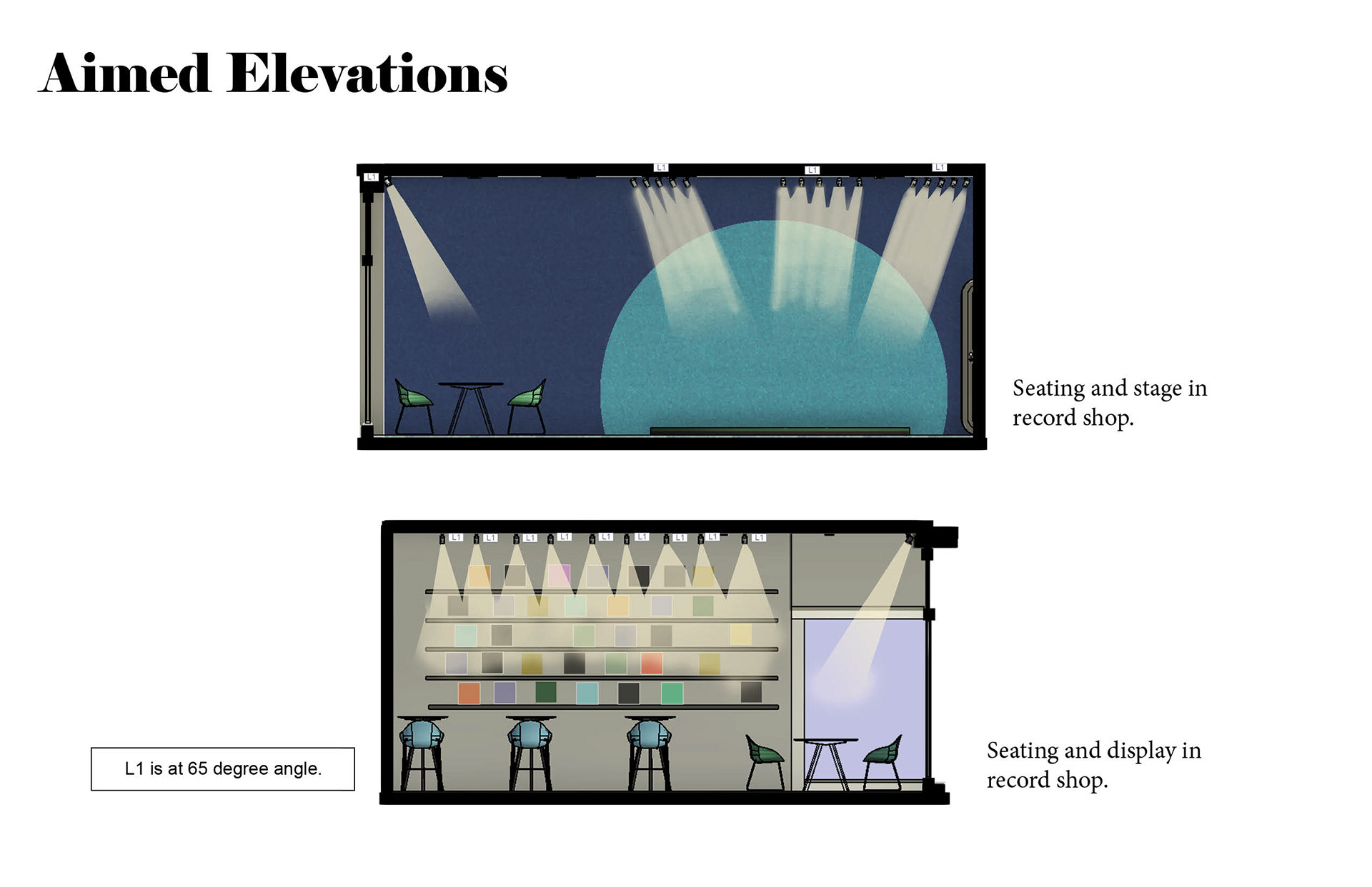
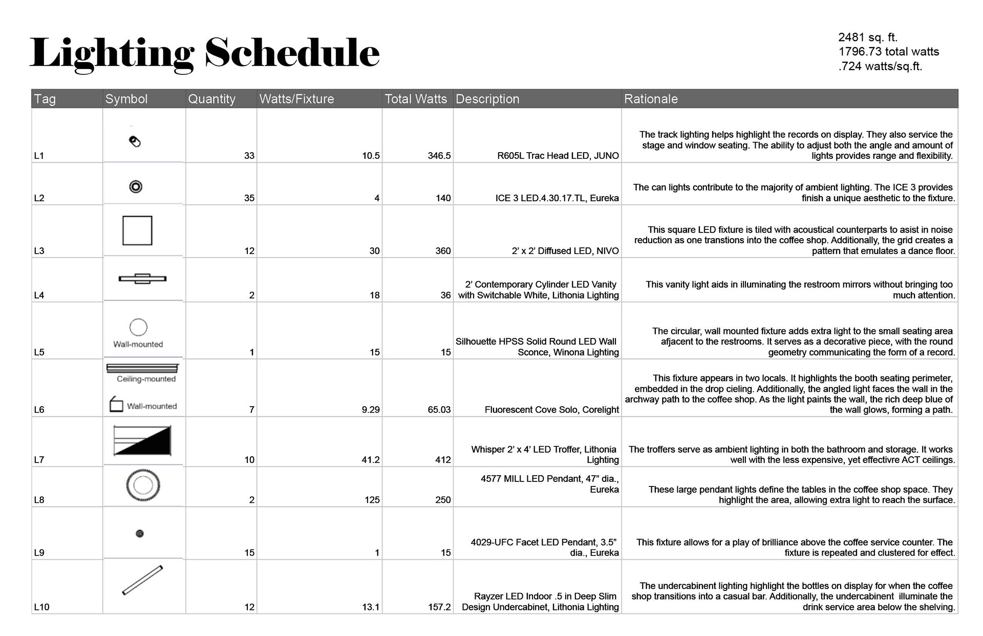
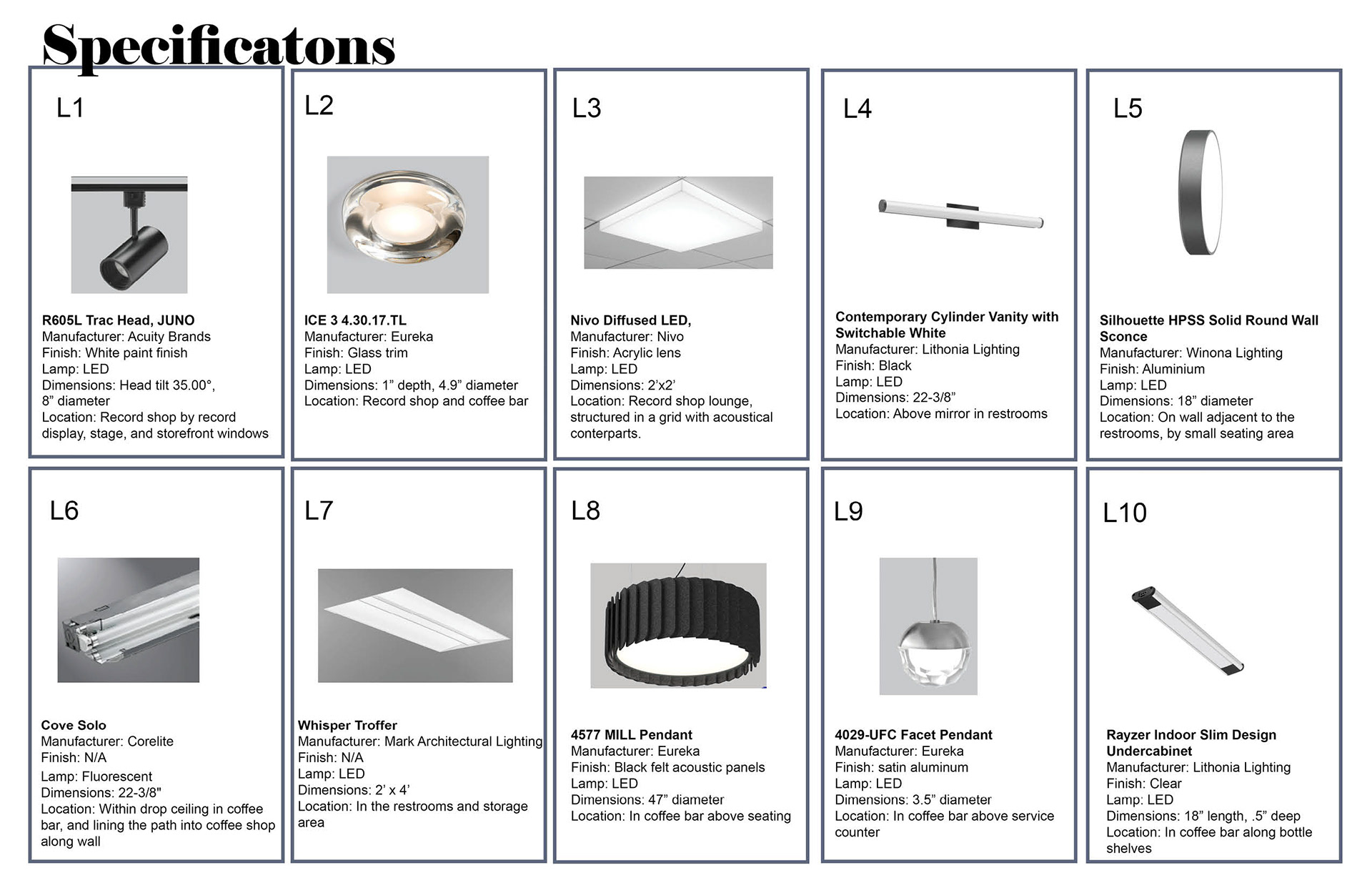
The lighting design will serve the space both functionally and aesthetically. Ambient lighting will fill the main cafe area. Can lights and trac lights will provide the majority of the ambient lighting. Upon entry, a grid of acoustical panel and square leds, emulating a dance floor, decorates and defines the record lounge. A stage set aside will have adjustable track lights for small live performances. The small tables in the window will capitalize on the daylight and transform it with color panes of glass, painting a pattern of colors in the space behind. An archway gestures for guest to enter the coffee shop as it is lined with colorful walls, glowing from reflected light. Large pendant lights define the group seating in the back of the cafe. Parallel, the ceiling drops around the booth, illuminating the perimeter. A play of brilliance will decorate and highlight the goods at the service counter. A bar adjacent to the counter will use light to highlight both underneath the bar counter as well as the display of bottles exhibited in front. Overall, the lighting aims to provide a vibrant and bright atmosphere, interact with color, and adjust to a more intimate setting in the evening.
After reviewing my renderings in the various lighting temperatures, I have determined that 3150 K is best for my project's coffee bar component. I noticed that my storefront is significantly cooler than the bar in the back of the space. The daylight coming in had much greater impact than I expected. It is best to use different temperatures between the spaces, to balance the cool daylight. The record shop area required a variety of lighting temperatures. It is a record store and a coffee shop, so maintaining light on the warmer side is important as the space is to be comforting, but not too warm it impedes focus. The space is a casual hangout spot day and night. It needs to feel social and lively, but also allow people to stay.
Experimenting with rendering in both Enscape and Revit. Enscape proved easier to control light levels as well as display the materials as intended. Revit took significantly longer to render, as well as multiple attempts due to choosing the settings without a preview.
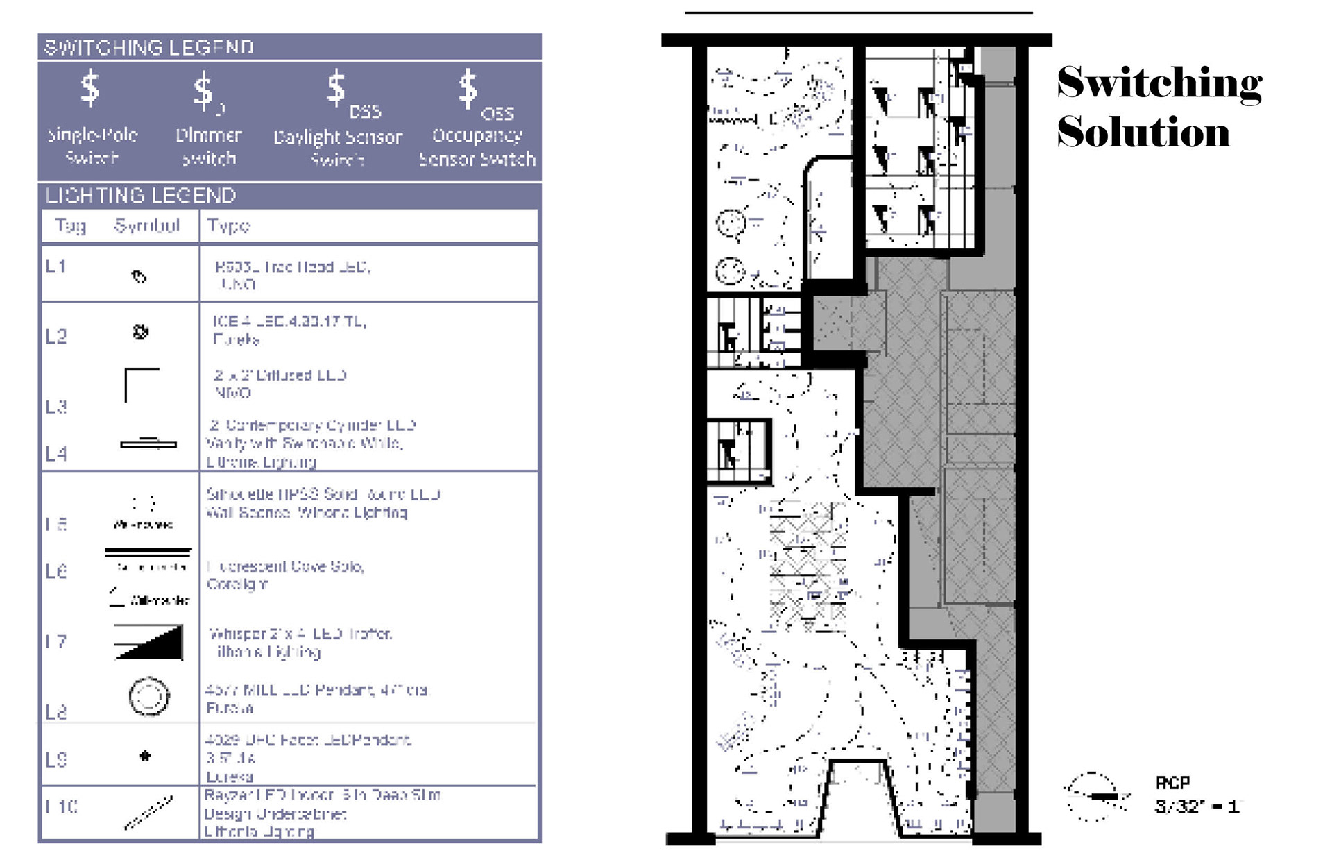
Lighting Documents
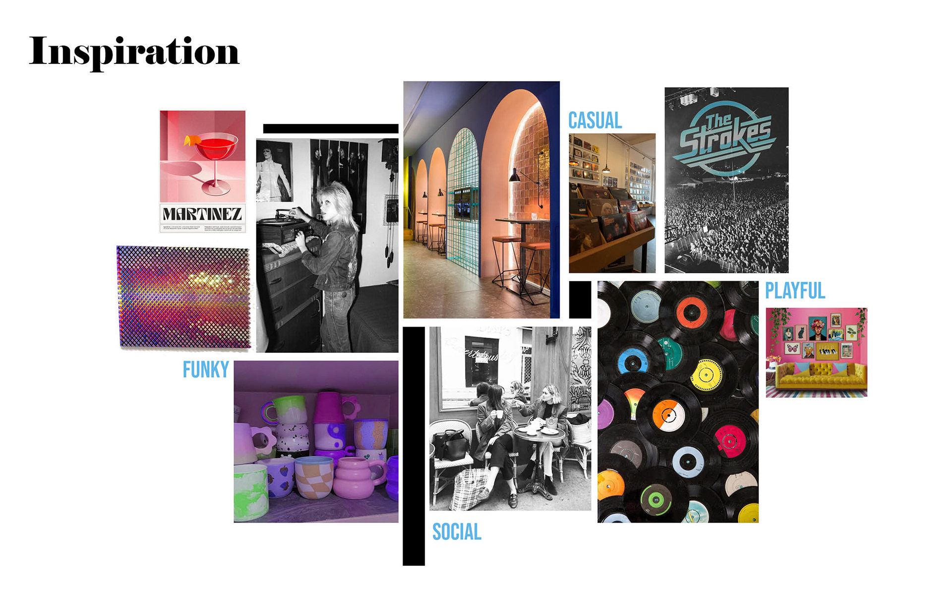
Inspiration
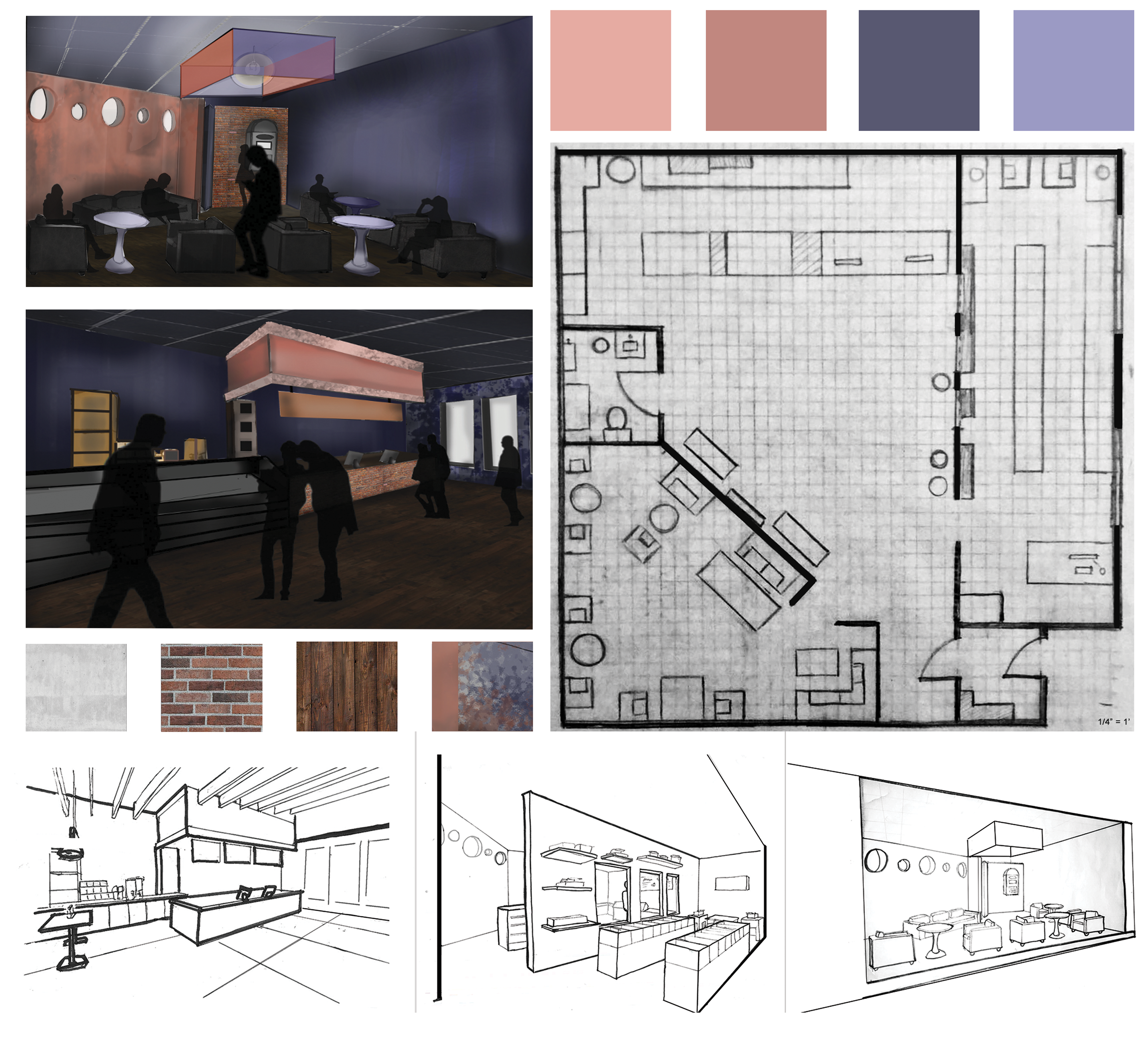
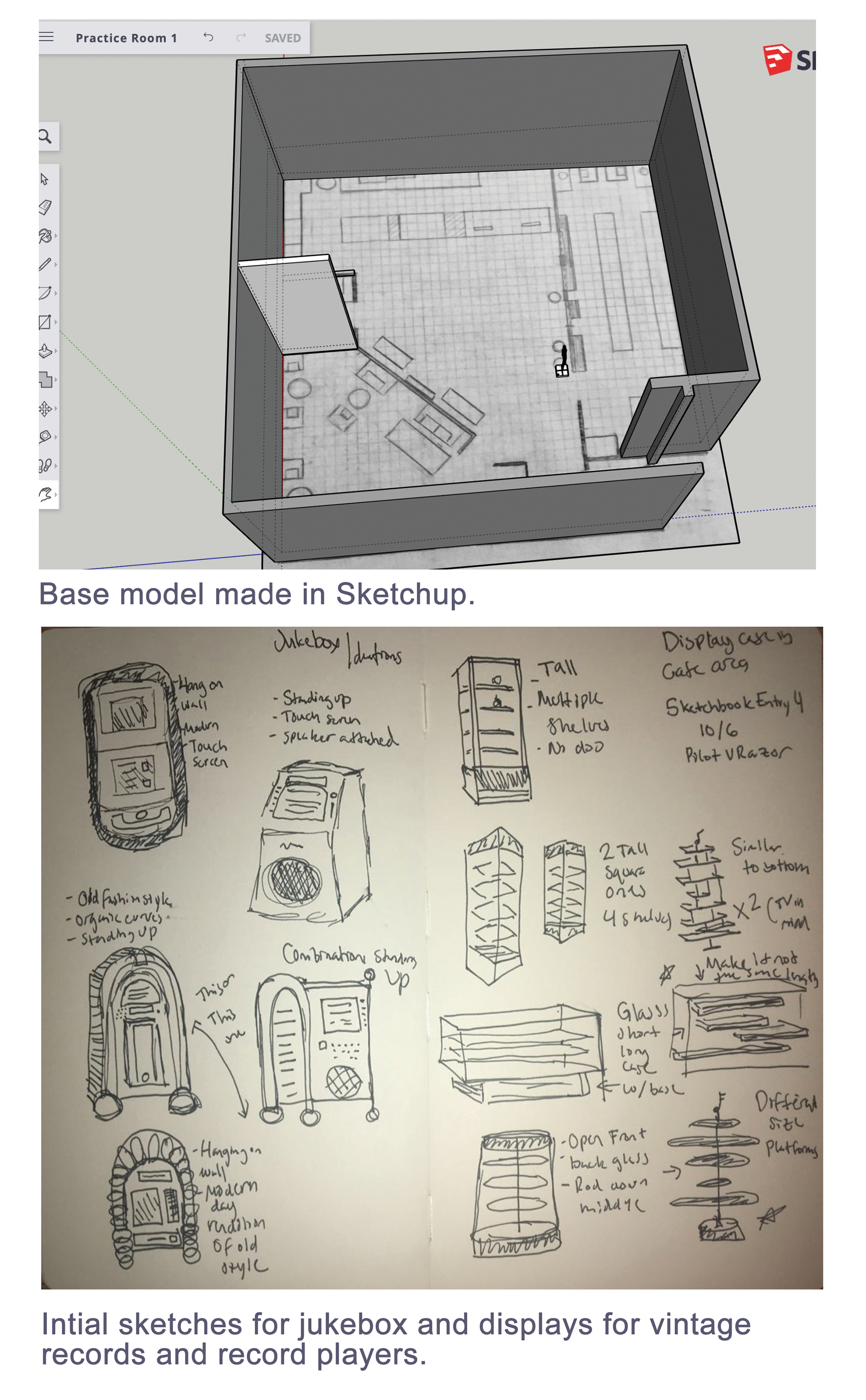
This project primarily focused on lighting, but as one of my final student projects, I decided to reimagine one of the first projects I did as an interior design student. The combination hangout cafe and record shop was an idea I originally had back in Fall 2020; however, the end design was in need of improvement. The project, illustrated on the right, was completed mainly by hand and photoshop, prior to my knowledge of Revit and Enscape. The original projected even allowed me to gain SketchUp experience. I believe the juxtaposition of these two works demonstrates my growth as a student.
